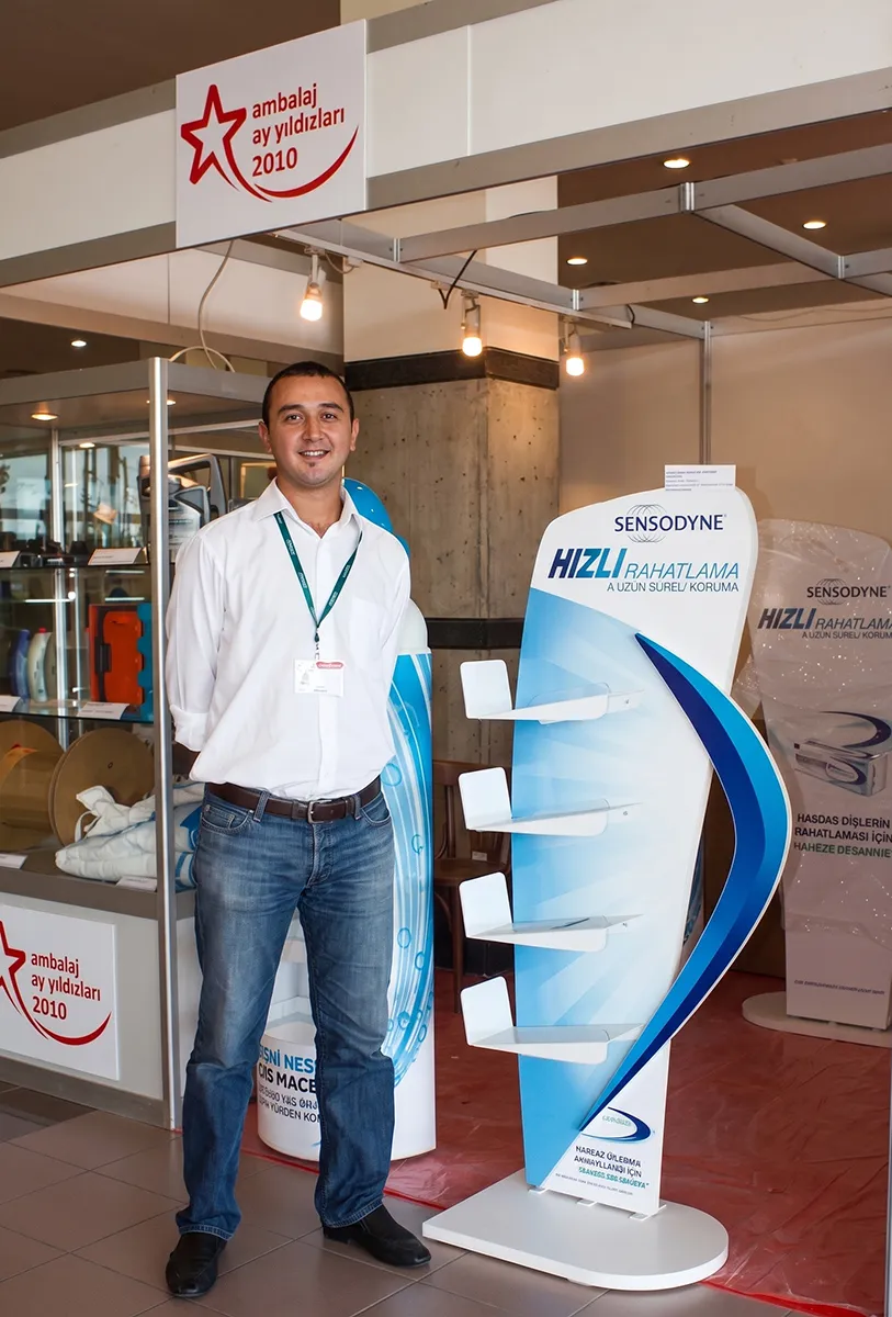
The Sensodyne Rapid Relief floor-standing stand we designed in 2010, when Doa Sense was still in its early stages, was awarded second prize in the Display Products category at the Packaging Star Awards 2010 Design Competition.
This award was not only a successful project for us, but also an early example of our approach that brings together brand identity, product visibility, and point-of-sale needs within a single design.
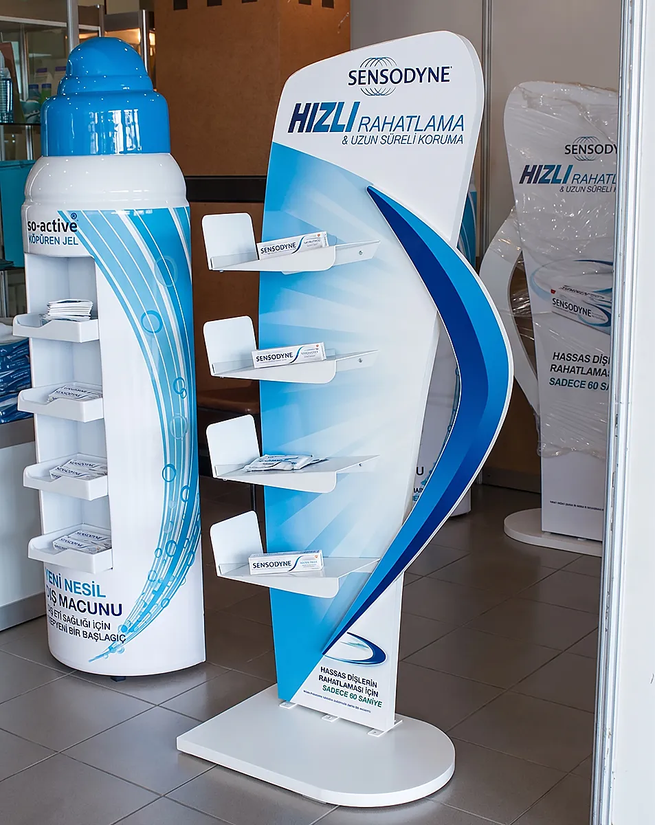
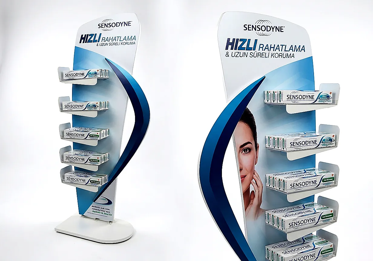
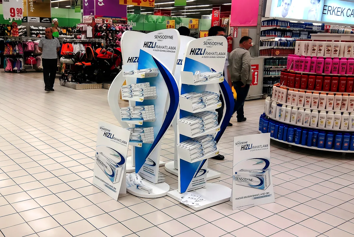
Award-winning floor-standing display stand designed for Sensodyne Rapid Relief.
From brand identity to three-dimensional display design
The design of the Sensodyne Rapid Relief stand is based on the white and blue colors used in the product packaging, as well as the brand's characteristic curved graphic design language.
The dynamic blue form on the packaging was transformed into a powerful three-dimensional design element on the side of the stand. Thus, the brand identity was not limited to graphic applications; the silhouette and overall geometry of the stand were also designed to maintain the same visual language.
The resulting unique design allowed Sensodyne products to be easily spotted from a distance within the point-of-sale area, while also facilitating a direct association of the stand with the brand.
A structure that addresses visibility and product access together.
It's just as important for a product display stand to present its products in an organized and accessible manner as it is to attract attention. Therefore, the design aimed to create a balance between visual impact and functionality.
The stand's four-tier shelving system allowed Sensodyne products to be displayed at different eye levels. The open shelving structure facilitated easy viewing and direct selection of the product by the consumer, while the large brand area at the top created a strong communication surface visible from various points of the point of sale.
The curved side form defined the stand's core character, while combining the graphic design area with the product display section into a single unit.
An early indication of our design approach.
The Sensodyne floor-standing display is an early example of Doa Sense's design philosophy, which it continues to this day: developing brand-specific, producible, functional display solutions that provide strong visibility in point-of-sale conditions.
For us, a good display stand design is not just an ordinary carrier with a brand logo on it. It's a sales communication tool that strengthens the product's positioning on the shelf, transforms the brand message into a physical experience, and effectively manages the moment of contact with the consumer.
In the Sensodyne project, visual codes taken from the product packaging were transferred to the stand's form, creating a strong design unity between the brand and the display unit.
The goal that has remained unchanged since 2010.
Winning second prize in the Packaging Star Awards 2010 Design Competition was a significant milestone in Doa Sense's design journey.
Although production technologies, materials, and retail environments have changed over the years, our core objective remains the same: to develop display solutions tailored to each brand's needs, enhancing product visibility and creating a strong point-of-sale presence for the brand.
Today, we approach all our projects, from freestanding stands to countertop displays, shelving applications to gondola and display coverings, with the same design discipline.
Because we believe that an effective display solution should not only showcase the product, but also make the brand visible and support the consumer's purchasing decision.