Nuttles Freestanding Nut Stand
Find the Stand You're Looking For
Filter projects by product type, material, and industry.
A New Scene for the Category
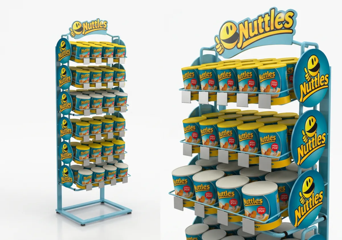
The nut and snack stand should combine high-volume package sales with a healthy snacking approach within the same visual system. The starting point of the project was to gather the multicolored packages into a strong brand block and prevent the different grammages from disrupting the shelf arrangement. Therefore, the design was considered not just a decorative carrier, but a communication system working between the brand, category, and store operation. The display language established for packaged nuts and snacks brings together the product's usage context, quality indicators, and the reason for purchase within the same viewing area. Thus, instead of creating an island independent from the main shelf, the stand produces a focal point that participates in the store's commercial flow but does not lose its brand character.
The Commercial Logic of Design
The visual backbone of the design is formed by a green-yellow brand palette, a slim metal frame, and stacked open shelves. This choice is not merely an aesthetic decision; it's a visibility strategy developed by considering approach distance, viewing height, and product packaging scale. The upper section supports brand recognition from a distance, the middle section facilitates product comparison, and the lower volume supports secure stock handling. Thanks to the controlled use of negative space, packaging graphics don't clash; the effect of full shelves is maintained without making the display heavy. The brand's color codes, product photos, and short benefit messages are also handled hierarchically, strengthening the stand's wayfinding function within the store.
Materials and Production Discipline
The merchandising approach is based on a shelving system that is organized by product type, weight, and consumption time, allowing for quick replenishment. This arrangement takes into account both initial setup and daily on-site management: the goal is for staff to quickly replenish products, keep price tags in the correct place, and easily identify low stock. As the rate at which products are viewed increases, shelf readability improves; visual boundaries between varieties also reduce the burden of decision-making for the consumer. Furthermore, the ability to re-configure the planogram during campaign periods transforms the stand from a one-off production into a flexible sales tool that responds to different SKU mixes. This flexibility directly creates commercial value in stores where square footage efficiency is critical.
Shopper's Journey
From the shopper's perspective, the goal is to encourage unplanned purchases by conveying the benefits of naturalness, freshness, and practical consumption in a matter of seconds. The design achieves this goal not with loud messages, but with intuitive cues: the accessibility of the products, the visual interplay between shelves, the sequence of color blocks, and where information is presented all work together within a single micro-journey. The consumer first recognizes the brand, then sees the category or benefit distinction, and finally compares the price and product format. This sequence reduces indecision while fostering a perception of brand expertise. Touching and examining the product in person is facilitated where necessary; the option architecture is simplified where a quick decision is expected.
The Impact of Production Details on Brand Language
The technical solution features a bent metal frame, electrostatic paint, interchangeable graphic sides, and adjustable shelves. Material selection was evaluated not only based on appearance but also on load, impact, cleaning, shipping, and reinstallation cycles. The serviceability of the joint details allows for the replacement of damaged graphic or shelf sections without replacing the entire stand. Surface quality and edge finishes also support the brand's promise of quality at the point of close contact. This approach ensures longer lifespan, a more consistent appearance, and lower maintenance requirements in the sales area while keeping production costs under control.
Expected Impact at the Point of Sale
The Nuttles Freestanding Nut and Snack Stand establishes visibility in the packaged nuts and snacks category not solely through logo size, but through a better selection experience. The stand's commercial success can be measured by metrics such as off-shelf contact count, product surface quality, replenishment time, cross-selling potential, and planogram alignment. Because the project addresses brand identity without separating it from store operations, it serves the shared goals of both marketing and sales teams. The resulting structure is not merely passive furniture storing products; it is a retail medium that organizes meaning within the category, shortens shopper decision-making time, and transforms the physical space allocated to the brand into communication capital.