
The success of a point-of-sale stand isn't measured solely by how it looks when completed. A good display unit should consistently carry the same design decision from the initial sketch to the technical drawing, from material selection to production details, and to actual use in the store. The wooden gondola cladding project we developed for Big Joy is a good example of how all stages of this process are legible.
The sports nutrition category is a dynamic one where numerous small-packaged products, such as protein bars, functional snacks, and nutritional supplements, compete in the same space. The design challenge here isn't simply "showcasing too many products." The brand must be recognizable from a distance; the products must be easily readable up close; the different packages must look organized; and the stand must be usable without burdening store operations. The story of the Big Joy stand began precisely at the intersection of these four needs.

The main issue resolved in the first line: visibility.
The character of the stand is immediately apparent in the industrial design sketch. The black main body provides a calm backdrop for Big Joy's strong and performance-oriented brand language, while the purple side supports define the stand's vertical silhouette. The orange base creates a contrast on the ground, separating the display unit from the store's overall furnishings.
The large Big Joy logo at the top is not just a decorative header; it's the main directional element that makes the stand visible from a distance. Consumers see the brand first, even before they can discern the products. As they get closer, the tiered shelf arrangement and product groups come into play. Thus, the design creates a two-stage communication: "brand from afar – product up close.".
The most striking decision in the sketch is the placement of the shelves in a slanted and alternating rhythm instead of a flat grid. This move brings the front faces of small packages into the field of vision while also breaking the monotony of the stand's vertical surface. The aim was for the shelves to appear not as aftermarket parts added to the supporting structure, but as a continuation of the overall form.

The transformation of a sketch into a technical drawing.
It's important for a concept drawing to look impressive; however, for it to go into mass production, every line needs to be transformed into a component, and every component into a feasible assembly detail. During the technical drawing phase, the front, side, and top views of the stand were considered together. The dimensional relationships between the body, shelves, curved side panels, header, and base were clarified.
Shelf angles, in particular, are one of the factors that directly affect the functionality of this project. Excessive tilt can cause products to move forward, while insufficient tilt can prevent the packaging surfaces from being fully visible. The vertical distance between shelves should also allow for sufficient access space for bar boxes and reinforcement packaging of varying heights. Technical drawing is the stage where aesthetic decisions and product ergonomics are tested on the same ground.
At this stage, it's necessary to consider not only the assembled stand but also the production sequence of the parts, the assembly method, the volume they will occupy during transport, and how they will be positioned in the store. Because a good point-of-sale design is not one that looks good in the design office, but one that can be replicated in production and works seamlessly in the field.
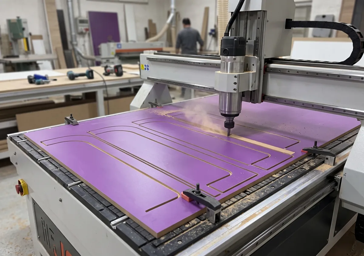
Manufacturable design: From CNC machining to assembly.
The Big Joy stand was manufactured using wood-based panel materials, combined with surfaces that match the brand's color palette. The photograph shows the purple body parts being machined on a CNC router. Computer-controlled cutting ensures that curved lines, connection points, and repeating parts are produced with the same precision.
In projects like these, mass production quality doesn't depend solely on machine precision. The edge finishing of cut parts, the positioning of rack carriers, the tolerances of joints, the fit of the painted metal base to the body, and the placement of graphic elements are all interrelated. A small deviation in one part can grow upwards in a multi-level racking system, resulting in a visible misalignment.
Therefore, the first sample also serves as a testing tool. Product placement, shelf load behavior, stand stability, logo viewing angle, and assembly sequence are evaluated on the prototype. Ensuring production repeatability while preserving the design language is a fundamental condition for transitioning to mass production.
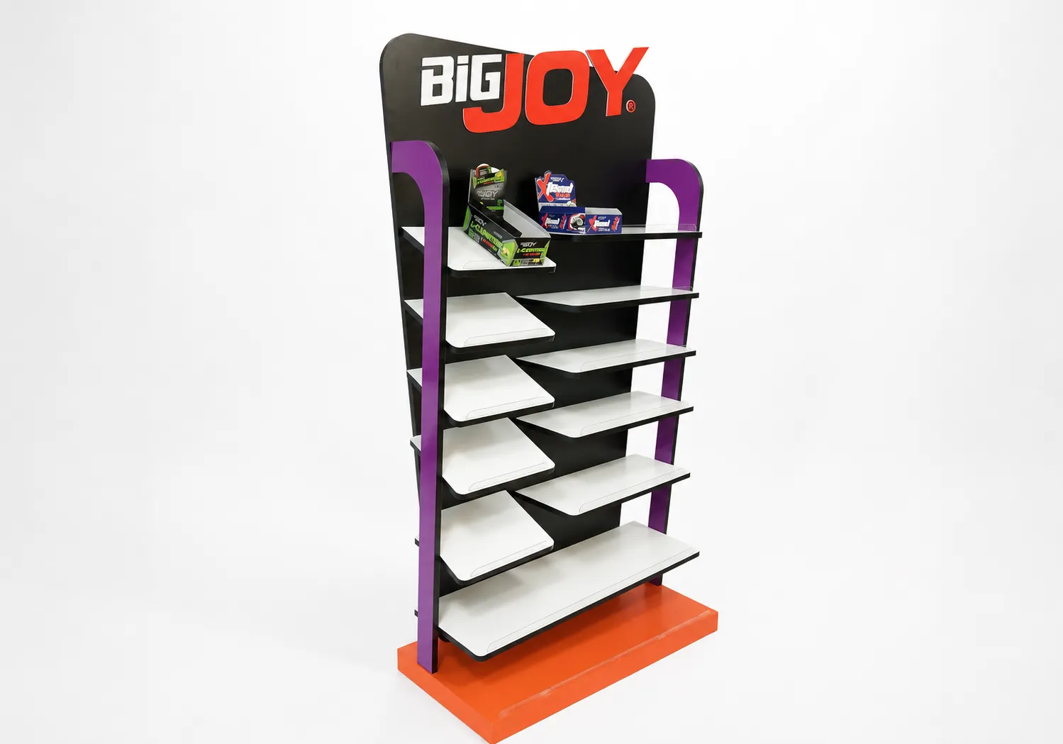
To convey brand identity not only through graphics but also through structure.
The studio photograph clearly shows the visual hierarchy of the stand. The black back panel frames the product packaging; white shelves illuminate the product areas; purple side elements support the body upwards; and the orange base strongly concludes the design on the ground. The colors function not as aftermarket decoration, but as structural elements defining the stand's components.
This approach makes a significant difference in POP and POS design. When brand identity is limited to the logo and print, the character of the stand can be lost when the graphics change. Here, however, the silhouette, shelf rhythm, and color blocks together create a display language unique to Big Joy. Even with the logo covered, the overall feel of the stand distinguishes it from an ordinary store gondola.
The alternating arrangement of white shelves adds dynamism to product presentation, while the black front edges accentuate the horizontal line of the shelves. This allows numerous small products to be displayed in controlled sections rather than creating a cluttered look.
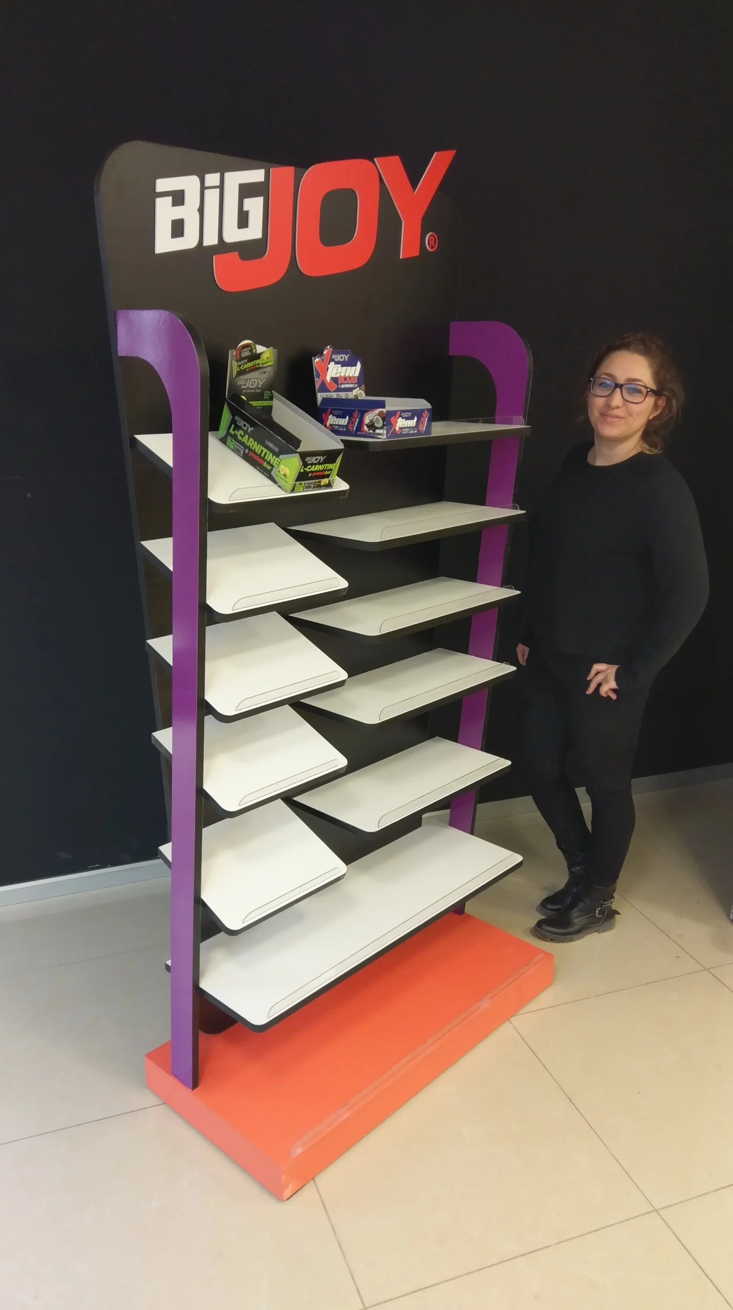
Final check for the designer: the distance between the line and the product.
A photograph of a designer standing next to the finished product actually brings together two different scales of the project in the same frame: the idea conceived on screen and paper, and the real object encountered by the human body. The image of Selin Gören, the designer of the Big Joy stand, alongside the product, makes it possible to read the height, reach, and visual impact of the stand on a human scale.
At this stage, the question isn't simply "Does it look like the design?". Is access to the upper shelves easy? Does the shelf arrangement get disrupted when a product is removed? Is the base secure in the passageway? Does the stand appear stable even when empty? Is the header at the correct height? The designer's post-production evaluation generates valuable information that can be carried over to future applications.
This is where the value of industrial design emerges: the project doesn't end as a visual proposal; it becomes a product that evolves through production, use, and observation.

Showroom: a trial run before the store.
Showroom photographs represent a crucial intermediate stage between studio shooting and field application. A stand that looks flawless against a white background may behave differently under real-world lighting. Glare, the perception of dark surfaces, the readability of the title, and the contrast between product packaging and the shelves can all be assessed more realistically in this environment.
Once the products are placed on the stand, shelf capacity and category organization become visible. While protein bars, energy products, and different can sizes are displayed under the same brand, consumers need to be able to distinguish between the options. Balancing increasing display capacity with keeping products legible is one of the most critical aspects of successful gondola design.
The showroom also serves as a reference for the field team to see the logic behind assembly and product arrangement. When the stand arrives at the store, it's already tested which product will go on which shelf, and how the logos and product blocks will form a cohesive whole.
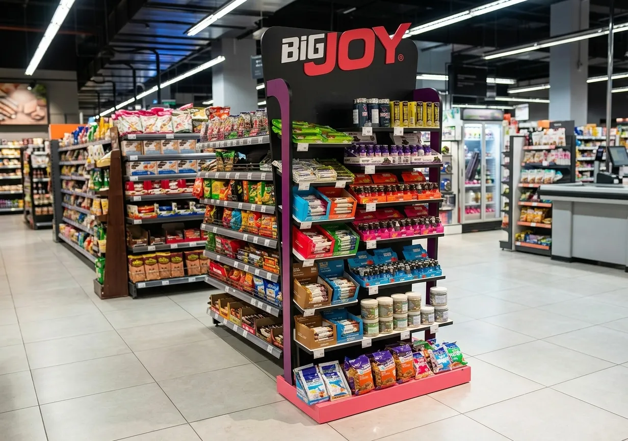
The real test: the actual selling point.
The final and most important image of the project comes from the store. The stand is no longer in a controlled studio or showroom environment; it's in a busy retail space with different brands, shelves, refrigerators, lights, and customer movement. Nevertheless, thanks to the large logo board and characteristic color blocks, the Big Joy area is recognizable from afar.
The stand's independent positioning creates a brand-specific facade without being bound by the physical limitations of a standard gondola system. The multi-tiered shelving provides high display capacity for small packaged products, while the slanted shelves bring the product faces into the customer's view. The strong color of the base defines the stand's boundaries; the vertical side elements direct the gaze towards the header.
The field photograph reminds us of an important fact: point-of-sale design should be evaluated not in isolation, but within the context of the surrounding visual noise. A successful stand distinguishes itself without being loud; it makes the brand visible without making product selection difficult and blends seamlessly into the store's daily operations.
Design lessons remaining from this project.
The Big Joy wooden gondola dressing project demonstrates that an effective retail practice is based on a few fundamental principles:
- A brand should first be recognizable by its silhouette: The logo is important; however, form, color scheme, and structural rhythm should also convey the brand.
- Shelf layout should be established according to product behavior: Packaging dimensions, weight, product handling, and the refilling process must all be considered together.
- Technical drawing is a continuation of design: Production details are not tools that limit the aesthetic idea, but rather tools that bring it to life.
- Prototype and showroom checks should not be skipped: Product placement and human scale can only be truly tested on a physical sample.
- The final decision is made on the field: The success of a stand is measured by actual store traffic and competitor communications in the surrounding area.
The resulting product transformed a standard gondola unit into a standalone sales and communication space for Big Joy. The process, from design sketching to CNC machining, technical detailing, and field implementation, demonstrates how the right design decisions, combined with production discipline, can create lasting retail value for a brand.
To view all project visuals and production information: Big Joy Wooden Gondola Cladding project page You can check it out. To develop gondola wraps, aisle displays, or point-of-sale display solutions tailored specifically to your brand. You can contact Doa Sense.